I am a highly experienced Lead UX designer with strong expertise in user-centered design, information architecture and usability. As a media neutral designer, I have extensive experience in a wide range of online & offline disciplines.
I hold a Master of Fine arts degree and have been working in web, print and multimedia design for 22 years. My core skills include originating ideas, developing concepts, building engaging ideas for desktop and mobile applications, advanced wire framing and html/css.
Feel free to click the link to send me an email

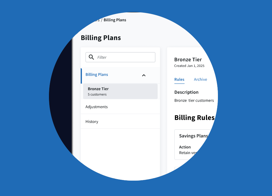
MSPs working across AWS, Azure, and Google Cloud need a way to price services differently for each customer segment while keeping billing consistent and manageable. Billing Plans solve this by grouping customers and applying a shared set of cloud billing rules to them each billing period, with the platform ensuring that every customer can only belong to one plan at a time.
This approach removes rule conflicts, reduces manual setup, and supports diverse pricing models—whether for departments, partner resellers, or specific client groups. Multiple plans can coexist, each tailored to different needs, making billing more accurate, transparent, and efficient.
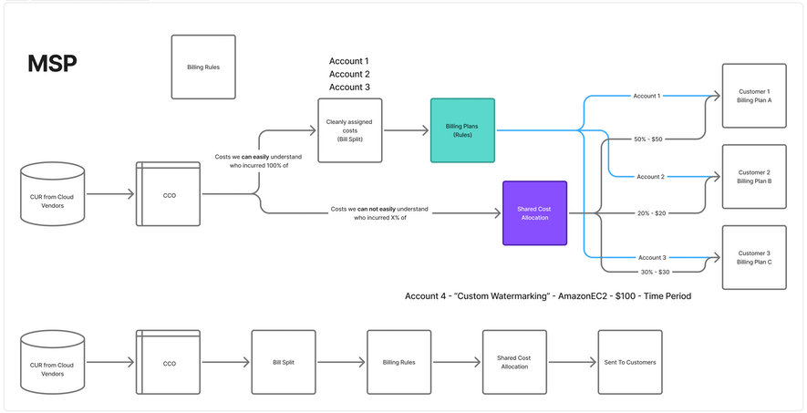
Primary pain point: billing rules had to be created and maintained for each client individually, which was slow, error-prone, and difficult to audit. The experience did not scale as the number of clients increased.
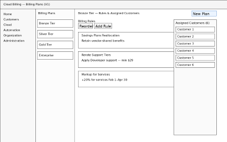
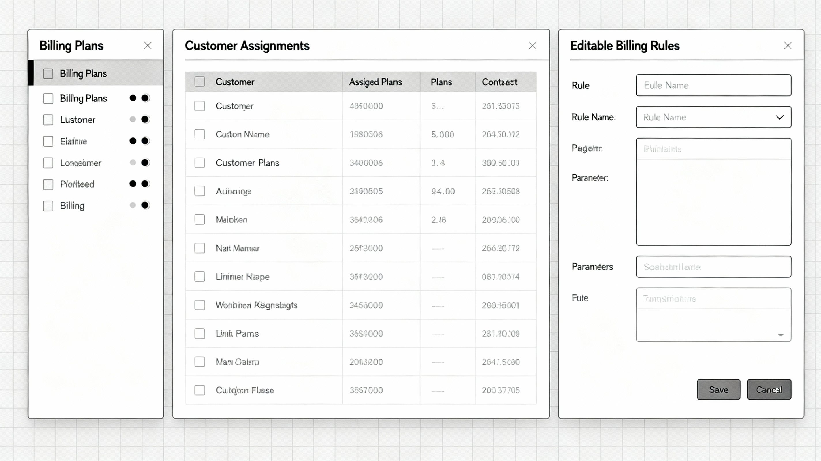
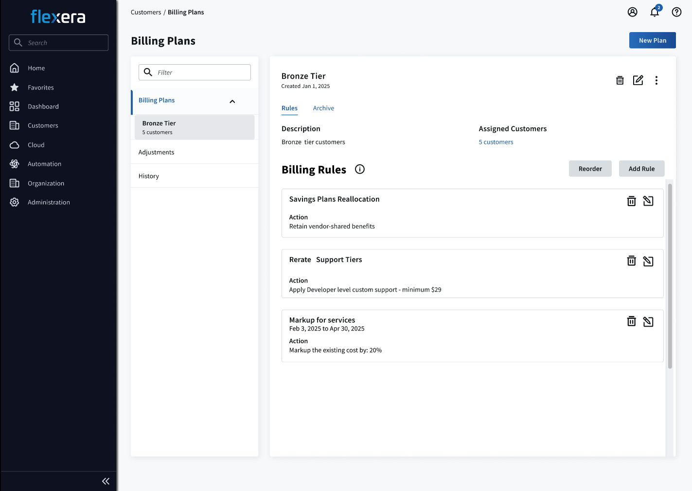
Introduces Billing Plans with a three-pane layout (Nav / Plans / Plan detail). Rules can be added, reordered, and customers are visible within the same view to reinforce the plan-first model.
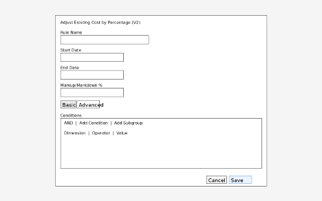
Adds a dedicated modal for “Adjust Existing Cost by Percentage,” including date bounds and a conditions builder (Basic/Advanced) to target providers (AWS, Azure, GCP), services, and regions.
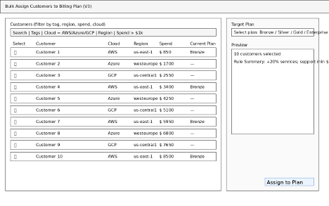
Directly addresses the main pain point by enabling bulk selection and assignment of customers to a single plan, with previews to detect conflicts and communicate resulting charges before applying changes.
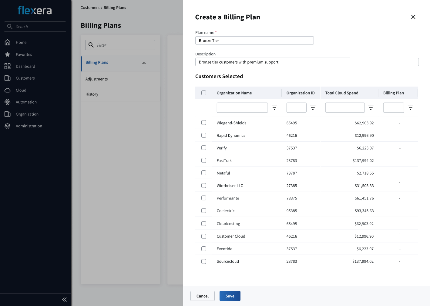
Creation of a billing plan and adding the customers
Choosing & Adding a rule
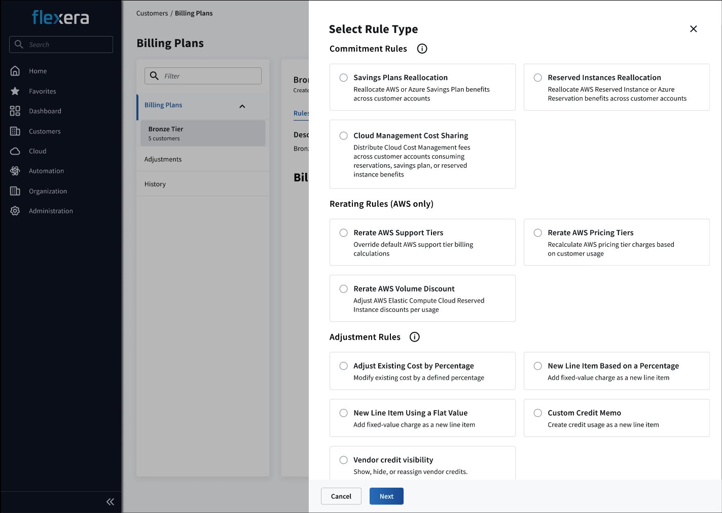
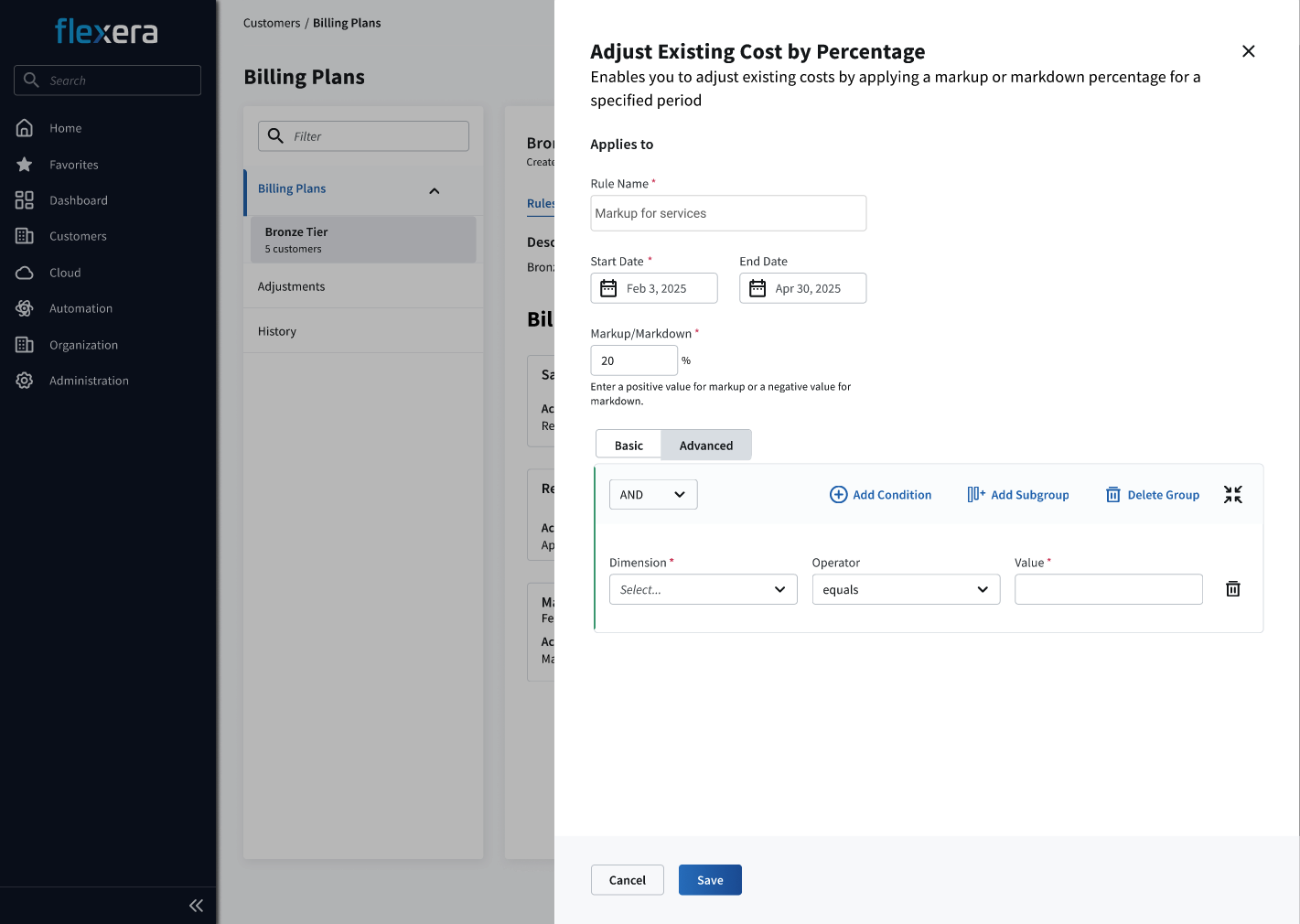
Finished billing plan


Hays jobseeker journeys started with a search for open roles followed by applying for a particular role. To increase applications, Hays encouraged users to apply as guests instead of creating or logging into accounts. This path was more visible, leading to few logged-in applications and almost no new account creations. Many users with accounts re-uploaded their CV for every application when applying as guests.
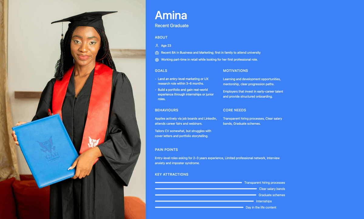

Research with Hays’ recruitment consultants and applicant placement statistics showed that guest applications were often of lower quality.
Hays prioritized direct communication with jobseekers and tracking users already in their database looking for new roles. Therefore, encouraging users to apply while logged in became essential.

I initiated efforts to personalize Hays' digital estate. Despite having high-quality content, all site visitors received the same prompts, with little engagement post-application to promote Hays as a knowledge leader.
To personalize content and job recommendations, Hays needed comprehensive user data. Recruitment consultants collected some data, but it was inconsistent. I suggested collecting information from logged-in users digitally post-application, when they are most engaged.
The post-application journey encouraged users to create accounts, log in, and provide more information about their career interests and paths.

The application start journey was redesigned to downplay the guest application and to encourage users with accounts to login. The "remember me" function was also added.

Job applicants who do not have an account with Hays are encouraged to create one. All the information needed to create the account is parsed from the uploaded CV so friction is greatly reduced by only requiring a password be entered.

Users who have chosen to continue on the guest application journey are prompted a last time to either create an account or to login to their existing account.

All job applicants are shown their account page with already collected information in their accounts. Addition questions are posed in order to learn more about the user. This data will be used to improve the suggested roles as well as personalise content.

A new home page for logged in jobseekers was designed with personalised content.


Honeybee is an innovative assistive sales product consisting of a tablet based application and a robust back end allowing for customisation of journeys and language as well as integration into existing enterprise systems.
The tablet application was designed to help brick and mortar sales reps to have access to the same wealth of information and search parameters currently found online to assist the salesman and customer in finding the right products based on their needs.
While the initial focus was on the mobile phone industry, the product was intended to be flexible enough to work well with other sales journeys such as appliances and automobile sales.
Download Pause and Resume product design document

1. The first project phase involved research into how mobile phone sales are conducted in terms of journeys and credit checks by top players in various countries. Differences in process and journeys were noted.

2. During the second phase, interviews were conducted with in store sales reps on and their line managers in order to get a full understanding of their current workflows, the tasks they needed to do and the pain points of the current system. Incognito visits were also made to stores to observe how reps handled different types of customers

3. The third phase consisted of iterative wire framing sessions working with the product manager to create a workflow and interface that would better suit the needs of users while considering any architectural constraints that could not be over come. These wireframes were presented to stakeholders within Honeybee to gain full team approval

4. A clean, visually applealing visual style was developed for Honeybee.

5. Extensive work was done on the Honeybee platform to make it more flexible and user friendly.


The Sky vodcast project goal was to replace a 20 year old content supply chain system. The existing system (BSS) was extremely slow, was difficult to use, did not fit the users current work flows and was over complicated. The team was tasked with creating a new, web based application based on modern technologies with an intuitive interface that reflected the actual tasks users needed to perform.
As Vodcast was also a transformation project, the team was tasked with educating the rest of a 180 person group on the benefits of using modern, agile development practices and design thinking to cut costs and improve the product delivered.

1. The first phase involved researching the current domain to get an understanding of the complexities involved and to create a glossary of industry and Sky specific terms that were used to describe different elements and functions of the system.

2. During the second phase, interviews were conducted with end users on different teams and their line managers in order to get a full understanding of their current workflows, the tasks they needed to do and the pain points of the current system. We also created a list of features they would like to have. From these interviews a series of personas and lists of user stories were created.

3. The third phase consisted of iterative wire framing sessions working with the product manager to create a workflow and interface that would better suit the needs of users while considering any architectural constraints that could not be over come. The interactive wire frames were presented to end users in a series of meetings in which their feedback was taken on board and changes to the wireframes made. This iterative process continued until all end users were happy with the software we proposed to deliver.

 Happy, less stressed users


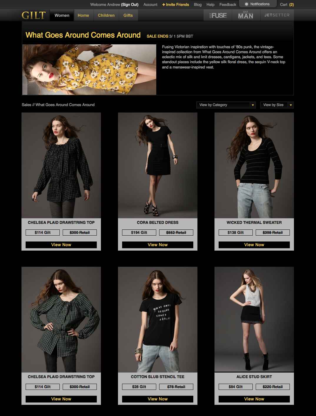
Gilt Groupe began as a startup looking to bring high fashion sample sales to the
e-commerce market in the U.S. Gilt’s proposition brought some unique challenges to their e-commerce UI.
New sales began every day. The products for sale changed daily and customers could not see what was for sale until 12 noon. Every product for sale had limited quantities. To prevent cart hoarding, products would remain locked in a customer’s cart for only 5 minutes. If checkout was not completed the product would be available again to other users and the customer could loose that purchase.

1. Gilt’s checkout requirements emphasized speed of completion over all other considerations. It was essential that users be able to quickly check their chosen shipping address and payment method in order to secure their purchase.

2. The check out interface was iterated over many times and tested repeatedly with users in order to find the optimum layout.
3. The break through came when we de-prioritized the list of products purchased in favor of shipping address and payment method.
Through trial and error, user testing and a/b testing we managed to create a truly one screen, one step checkout system that allowed users to quickly check out and secure their highly desired items at a significant discount.


Efinancial Careers had virtually no mobile presence as their site was not responsive and they had not produced a mobile app. My remit was to re-start a twice failed mobile application project. The biggest challenge involved managing a group of 13 stakeholders located across the world’s financial centers.
With each attempt to realize the project, the requirements list had grown to the point that the project was unrealizable within the budget constraints. It was necessary to whittle down these requirements to something that would satisfy the core needs and provide the company with the mobile presence it needed to be competitive.

1. A survey was conducted of both job searchers and recruiters to identify what functionality they felt was essential in a job search mobile application.

2. By leading a series of group sessions involving all project stakeholders, I reduced the requirements list to the absolute minimum that all could agree on and still remain in budget.

3. A process of iterative wireframing of all app functionality was implemented taking care to make sure all stakeholders agreed and that the user journeys would function well across the international markets and cultures efinancial careers did business in.
Challenges that needed to be over come were issues around language localization and the need for a CV to be attached by any user trying to register with the site for the first time. Restrictions within iOS and the fact that use of cloud services around the world differs greatly added to the complexity of the project.
The project was extended to include a new, responsive design for the main EFC site


MyBuilder's business straddled the B2C and B2B markets. Home owners posted jobs they needed to be done while the tradesman were MyBuilder's actual paying clients
While MyBuilder wanted more job postings in general they were concerned that the leads supplied to tradesman were solid. There was also a drive to have more larger projects such as extensions and renovations posted to increase revenue.


Tracker's Fleet application is a high end fleet management tool used by managers of some of the largest vehicle fleets in the UK.
The application had not been updated in several years and was in need of a visual refresh as well as a set of compelling new features to keep the product competitive.

Tracker Pulse is a connected vehicle application for iOS and Android that allows user to monitor their driving style, fuel usage, journeys and to read any faults generated by the vehicle's computer in plain language.
